| |
TWiki Forms - Foundation of TWiki Applications |
| |
A Form Template specifies the fields in a form. A Form Template is simply a page containing a TWiki table, where each row of the table specifies one form field. |
|
<
< | Each column of the table is one element of an entry field: Name, Type, Size, Values, Tooltip message, and Attributes. |
>
> | Each row of the table defines one element of an input field: |
| | |
|
<
< | The Name, Type and Size columns are required. Other columns are optional. The form must have a header row (e.g. | *Name* | *Type* | *Size* |).
Name column: Name is the name of the form field.
Type, Size, Value columns: Type, Size and Value describe the type, size and initial value for this field: |
>
> |
| Name |
Type |
Size |
Values |
Tooltip message |
Attributes |
|
| | |
|
<
< |
| Type |
Description |
Size |
Value |
text |
One-line text field |
Text box width in number of characters |
Initial (default) content |
textarea |
Multi-line text box |
Columns x rows, such as 80x6; default is 40x5 |
Initial (default) content |
label |
Read-only text label |
|
Text of the label |
checkbox |
One or more checkboxes that can be toggled individually |
Number of checkboxes shown per line |
Comma-space-separated list of item labels - can be a dynamic SEARCH |
checkbox+buttons |
Like checkbox, adding [Set] and [Clear] buttons |
radio |
Radio buttons, mutually exclusive; only one can be selected |
Number of radio buttons shown per line |
Comma-space-separated list of item labels - can be a dynamic SEARCH |
select |
Select box, rendered as a picklist or a multi-row selector box depending on the size value |
• 1: Show a picklist
• Number > 1: Multi-row selector box of specified size
• Range e.g. 3..10: Multi-row selector box with variable size - the box will never be smaller than 3 items, never larger than 10, and will be 5 high if there are only 5 options |
Comma-space-separated list of options of the select box - can be a dynamic SEARCH |
select+multi |
Like select, turning multi-select on, to allow Shift+Click and Ctrl+Click to select (or deselect) multiple items |
select+values |
Like select, allowing definition of values that are different to the displayed text. For example:
| Field 9 | select+values | 3 | One, Two=2, Three=III | Various values formats |
shows but the values of options Two and Three are 2 and III, respectively. |
select+multi+values |
Combination of select+multi and select+values |
color |
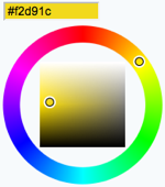 Single-line text box and a color picker to pick a color. The color can also be typed into the text box, such as Single-line text box and a color picker to pick a color. The color can also be typed into the text box, such as #123456.
An attribute of type="popup" shows a button that, when clicked, opens a color picker popup. See details. |
Text box width in number of characters |
Initial (default) color |
date |
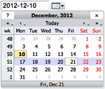 Text input field and a button next to it to pick a date from a pop-up calendar. The date can also be typed into the text box. See details. Text input field and a button next to it to pick a date from a pop-up calendar. The date can also be typed into the text box. See details. |
Text box width in number of characters |
Initial (default) date |
|
>
> | The Name, Type and Size columns are required. Other columns are optional. The form template must have a header row, e.g. at least | *Name* | *Type* | *Size* | is required. Columns: |
| | |
|
<
< | Tooltip message column: The Tooltip message will be displayed when the cursor is hovered over the field in edit view. |
>
> |
- Name column:
Name is the name of the form field.
|
| | |
|
<
< | Attributes column: Attributes specifies special attributes for the field. Multiple attributes can be entered, separated by spaces. |
>
> |
- Type, Size, Value columns:
Type, Size and Value describe the type, size and initial value of this form field. Type text, checkbox, select and more are described in the Form Field Types section below.
|
| | |
|
<
< |
- An attribute
H indicates that this field is hidden, e.g. not shown in view mode. However, the field is available for editing and storing information.
|
>
> |
- Tooltip message column: The
Tooltip message will be displayed when the cursor is hovered over the field in edit view.
|
| | |
|
<
< |
- An attribute
M indicates that this field is mandatory. The topic cannot be saved unless a value is provided for this field. If the field is found empty during topic save, an error is raised and the user is redirected to an oops page. Mandatory fields are indicated by an asterisks next to the field name.
|
>
> |
- Attributes column:
Attributes specifies special attributes for the field. Multiple attributes can be entered, separated by spaces.
- An attribute
H indicates that this field is hidden, e.g. not shown in view mode. However, the field is available for editing and storing information.
 Tip: The TWiki form header is suppressed in view mode if all fields of the form are hidden. For better usability it is good to hide the whole form if the display and interaction of all form fields is done externally. For example, the display and modification of form field values can be done in a header topic that is included in each page. Tip: The TWiki form header is suppressed in view mode if all fields of the form are hidden. For better usability it is good to hide the whole form if the display and interaction of all form fields is done externally. For example, the display and modification of form field values can be done in a header topic that is included in each page.
- An attribute
M indicates that this field is mandatory. The topic cannot be saved unless a value is provided for this field. If the field is found empty during topic save, an error is raised and the user is redirected to an oops page. Mandatory fields are indicated by an asterisks next to the field name.
|
| |
For example, a simple form just supporting entry of a name and a date would look as follows: |
| |
- The topic definition is not read when a topic is viewed.
- Form definition topics can be protected in the usual manner, using TWikiAccessControl, to limit who can change the form template and/or individual value lists. Note that view access is required to be able to edit topics that use the form definition, though view access to the form definition is not required to view a topic where the form has been used.
|
|
>
> |
Form Field Types
Each table row of a form template defines one element of an input field:
| Name |
Type |
Size |
Values |
Tooltip message |
Attributes |
Many types of form fields are available. Some are TWiki internal, some are provided by extensions. Find more TWiki form field extensions on TWiki.org. The on TWiki.org. The Size and Value depend on the Type used. Form field types:
| Type |
Description |
Size |
Value |
text |
One-line text field |
Text box width in number of characters |
Initial (default) content |
textarea |
Multi-line text box |
Columns x rows, such as 80x6; default is 40x5 |
Initial (default) content |
label |
Read-only text label |
|
Text of the label |
checkbox |
One or more checkboxes that can be toggled individually |
Number of checkboxes shown per line |
Comma-space-separated list of item labels - can be a dynamic SEARCH |
checkbox+buttons |
Like checkbox, adding [Set] and [Clear] buttons |
radio |
Radio buttons, mutually exclusive; only one can be selected |
Number of radio buttons shown per line |
Comma-space-separated list of item labels - can be a dynamic SEARCH |
select |
Select box, rendered as a picklist or a multi-row selector box depending on the size value |
• 1: Show a picklist
• Number > 1: Multi-row selector box of specified size
• Range e.g. 3..10: Multi-row selector box with variable size - the box will never be smaller than 3 items, never larger than 10, and will be 5 high if there are only 5 options |
Comma-space-separated list of options of the select box - can be a dynamic SEARCH |
select+multi |
Like select, turning multi-select on, to allow Shift+Click and Ctrl+Click to select (or deselect) multiple items |
select+values |
Like select, allowing definition of values that are different to the displayed text. For example:
| Field 9 | select+values | 3 | One, Two=2, Three=III | Various values formats |
shows but the values of options Two and Three are 2 and III, respectively. |
select+multi+values |
Combination of select+multi and select+values |
color |
Single-line text box and a color picker to pick a color. The color can also be typed into the text box, such as #123456.
An attribute of type="popup" shows a button that, when clicked, opens a color picker popup. See details. |
Text box width in number of characters |
Initial (default) color |
date |
Text input field and a button next to it to pick a date from a pop-up calendar. The date can also be typed into the text box. See details. |
Text box width in number of characters |
Initial (default) date |
|
| | Values in Other Topics
As described above, you can also retrieve possible values for select, checkbox or radio types from other topics. For example, if you have a rows defined like this: |
 Copyright © 1999-2024 by the contributing authors. All material on this collaboration platform is the property of the contributing authors.